Pathfinder

Exclude

Unite

Minus Front

Intersect
vector self-portrait

Logo assignment
Logo design research

Applebee's has a very simple logo, but it works. I'm pretty fond of the stylized apple image, and appreciate the use of red and green colours which match with that of an apple.
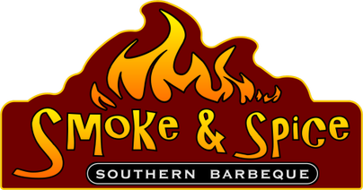
Smoke & Spice has a nice logo, the choice of colours as well as the fire image above indicate that the food there is spicy.

I'm not a big fan of the Stir Crazy logo, as it feels really plain. The chopsticks in the middle hint at it begin Asian food, making them appropriate in the centre of the logo.
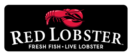
Red Lobster's logo is pretty plain and boring as well. The standard font and image of the red lobster above seem a little obvious and uninteresting. The black and white contrast for the text is good though.
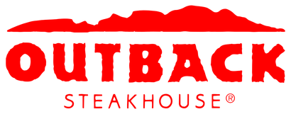
Outback Steakhouse's logo is well designed, and I like the rugged feel of the text and the image of the outback's rugged terrain above as well. The nice logo doesn't make up for the bad food though :P
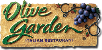
I like Olive Garden's logo because it gives a rustic, Italian feel which perfectly convey that it's an Italian restaurant. The grapes also give a little taste of Italy too.
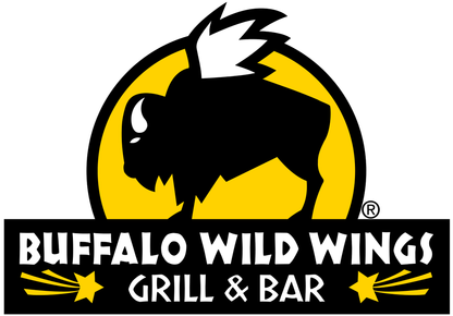
Buffalo Wild Wings is a local grill here in Windsor. I really like the logo, as the black, yellow and white colours all have really nice contrast. The stylistic drawing of the "wild, winged buffalo" lends itself to the name of the restaurant well.
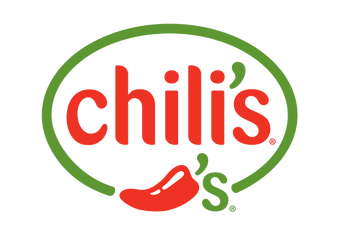
Chili's has a simple but effective logo. The red and green have nice contrast that makes it eye-popping, and are, of course, the colours a regular chill pepper.
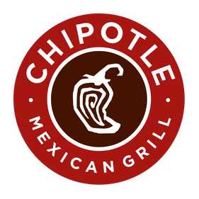
Chipotle is a restaurant chain with locations all over North America, Europe and the U.K. They specialize in Mexican food, particularly burritos and tacos. Chipotle's logo is simple but effective, with an image of a chipotle pepper in the center; "chipotle" is the Mexican Spanish name for a smoked and dried jalapeno pepper, making it a fitting logo for the company.
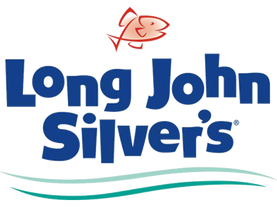
This logo is for Long John Silver's, a family seafood restaurant. I like the logo because the cartoonish style and playful font convey the idea that this is a friendly restaurant suited for families. The fish and waves below hint that it's seafood.
creative brief worksheet
Project Summary
What type of product or service do you offer?
I cook meals with my students during the first half of the school day, then serve them as lunch to the staff of St. Joseph's.
How long have you been in business?
I've been serving meals to the staff for 5 years now.
What do you hope to accomplish with your new identity?
With my new identity, I hope to make my kitchen more popular among the staff, so I can increase my business.
What are your long term goals?
I want to be drawing in more customers on a daily basis, and make enough money so we can buy brand new equipment so we can improve the kitchen.
Audience Profile
Please describe your existing audience.
My existing audience is the staff, particularly the teachers of St. Joseph's High School.
Who would you like to add to your audience?
Only staff can eat in my kitchen, so I'd like to draw in any more teachers who don't eat here at lunch.
Perception/Tone/Guidelines
Do you have any colours in mind for your logo? (if so, why?)
Most of the colours are interchangeable and won't really matter. I'll need white for the chef's hat, but the utensils and banner could be any colour. I'd either prefer something bright/eye-popping or with lots of contrast so it catches the eye of anyone walking by.
Do you have any specific images or icons in mind that you would definitely like to see incorporated into your logo?
I definitely want images that relate to my line of work; cooking utensils like forks, knives, whisks etc. A chef's toque would be a nice touch as well.
Communication Strategy
What is your tagline or slogan?
I'd like my tagline or slogan to be something funny like, "Ain't no pork on this fork", "Kiss the cook" or "Make dinner, not war". If I were to pick a more serious slogan I'd choose something like "A Taste of Home".
What is the overall message you are trying to convey to your target audience?
I want my target audience (the staff) to know that I am an experienced and seasoned (pun intended) chef who makes quality food for a good price.
Where will your new logo be used?
My new logo will probably be used in the kitchen, on my menus, or on the door outside my kitchen. I'll probably post it along with the menus I post on Google+ for the staff.
Competitive Positioning
Who are your competitors and what do you think about their logos?
My competitors are any other eatery that a teacher would go to for lunch. Most of them are fast-food companies with nice, professionally made logos that convey what the company is all about while looking good.
List the competitive URLs (websites) if possible.
www.mcdonalds.ca
www.burgerking.ca
www.wendys.ca
www.subway.ca
www.smokenspice.com
What sets you apart from your competitors?
Aside from Smoke 'n' Spice and Subway, all of my competitors are fast-food places that offer unhealthy food. I offer home-cooked, healthy meals with a friendly environment where the teachers can eat together and socialize. Also, being situated inside the school makes it easier and more convenient for the teachers to eat here; they don't have to waste time or gas money driving out to McDonald's or some other eatery.
Targeted Message
State a single-minded word or phrase that will appropriately describe your company.
Home-cooked meals.
The logo
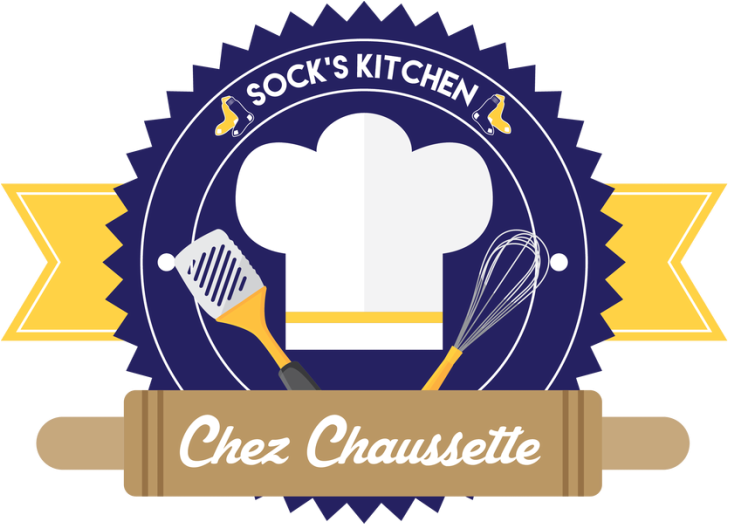
This is my preferred design which I intended for Mr. Sok to use. I used blue and yellow because they were the school colours, and gave it a heading "Sock's Kitchen", which is a pun on his name, and placed sock images next to them. In the centre I used a chef hat, spatula and whisk to convey that this is a restaurant. After showing it to Mr. Sokolowski, he had some changes in mind. Here's the end result:
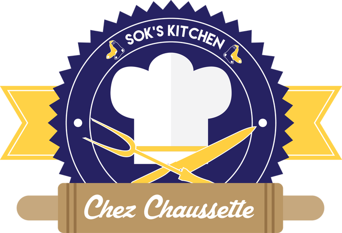
I don't really like it myself, but the client comes first ;)
